Project. Type
as Metaphor
Purpose. To use the elements of
typography (paragraphs, phrases, words, syllables, letters, etc.) in
ways that transcend the utilitarian, the literal, and the pre-packaged.
To develop typographic settings for a text that give form to metaphoric
implications or connotations through compositional arrangement,
juxtaposition, and typographic manipulation. To exercise various
modes of critical thinking, mind mapping, and formal play in an
effort to find new meaning and shape for a given text.
Assignment. Find three
texts from magazines/journals/books/on-line, which deal with a
particular issue you care deeply about or have some concern towards.
Examples of topics could be: global warming and its affects on
hurricanes, the longevity of cockroaches as a species, the doctrine
of pre-emptive war, race relations, violence against women, censorship,
globalization, etc. These are only examples of topics. After reading
all three texts related to your chosen topic, select one as your
primary source, or a re-edit of the three into one. Brainstorm
ideas in order to find visually metaphoric possibilities. Take
a large sheet of paper, write down the main theme or topic and
draw a circle around it. Then, map other words and phrases that
in some way relate to the central theme (sub-themes, activities,
images, physical attributes, emotional responses, other tangents
to generate ideas). Form tributary lines, directionals, and new
words and phrases. Develop compositions that resonate (have the
feel of, suggest, evoke) a few of the themes, sub-themes and other
visual/semantic references that you’ve discovered. This project
will be realized entirely with type, color, texture and shape.
It is divided into 4 parts:
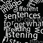
Paragraphs / Phrases. Edit your text down to a few
paragraphs with key phrases. Then create a composition, your choice
of dimensions, which uses type as metaphor to visually communicate
your analysis, or point(s) of view on the subject/text. Experiment
with a variety of approaches and tools. Don’t assume first
ideas and solutions are the best. Take chances, you can always
tighten things up later. Feel free to sketch ideas and use techniques
you played with in first project like photocopying, using different
materials/printing techniques, as well as the computer. Solutions
need not be technically complex.
Words. Next, select a series of words from your phrases.
Create a second composition, continuing to manipulate type as metaphor.
You should already be thinking in terms of creating a series, progression,
or narrative from one composition to the next.
Syllables. Edit the words down to a series of syllables.
In this composition, literal meanings have less significance. Again,
experiment with type and composition, but now focus further on
the expression through the letterforms themselves, as well as through
their arrangement on the page.
Letters. With the last composition, focus on the
letters you have selected from your above syllables — to
form a final composition via type as a metaphor.
All Told. The end result will be four final compositions.
Try to not be seduced by the computer and its
built-in aesthetic predilections. Focus on meaning and form. These
experiments might have more “applicability” in the
end than you might imagine.
Note. Warren Lehrer was first introduced to a variation
of the "Type as Metaphor" project by Mike Schmidt (University
of Memphis) who picked it up from Andrew Blauvelt.
Format. Open
Time. Five Weeks
Week One. Project
introduced.
Week Two. Present subject, 3 texts, edited paragraphs/phrases/words
of interest, initial mind-maps and sketches. Begin roughs in
class for paragraphs/phrases panel. Consider format, type choices,
color,
texture....
Week Three. Present working comps of paragraphs/phrases and words
panels (with actual type). Rework/play. Begin working on syllables
and letterforms.
Week Four. Present working comps all 4 categories. Re-work, refine,
tweak, production of final compositions.
Week Five. Final crit. New project introduced.
|
|