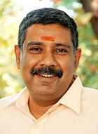
G.V. Sreekumar, born 1965, completed Applied Art from the Faculty of Fine Arts at M.S. University of Baroda in 1990. After completing the Master of Design (M Des) in Visual Communication from the Industrial Design Centre (IDC) at IIT Bombay in 1992, he worked for various publications in India, including The Times of India Group, The Indian Express and Jasubhai Digital Media. He joined IDC as a faculty member in June 2000, teaching typography, information graphics, illustration, publication design and life drawing. Sreekumar specialises in the area of magazine design and font design and has designed many magazines in India including CHIP, Digit, Society, Savvy, Kanyaka (Malayalam), Overdrive, CTO forum, Chandamama etc. He also conducts experiments with students in various topics ranging from typographic installations to experimental font design.
Sreekumar takes inspiration from his predecessor Prof. R. K. Joshi in encouraging students to take up innovative projects in Indian language typography and publication design.
www.idc.iitb.ac.in
Return to top |
 |
Typefaces:
Personal Preferences |
|